Museum IdentityMuseum Identity
![]()
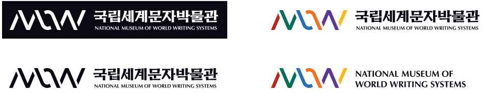
- M.I.(Museum Identity)
- The M.I. logo of the museum is composed of the alphabetic characters M and W, which are almost mirror images of one another, connected by a space representing the letter O. Expressed in six three-dimensional strokes, these striking characters are combined with a logotype inspired by engraving scripts. By subverting the traditional order and hierarchy of reading from top to bottom and left to right, the M.I. logo signifies understanding and coexistence with various cultures around the world, as well as diversity and respect.
- Symbol Mark
- As the primary identifier of the museum, the symbol mark encompasses all of the most integral artistic and symbolic characteristics of our brand in a single emblem. As such, it appears prominently in all visual communications, both internal and external, ranging from various advertisements to print media, video media, and signage.
- Museum’s Colors
- The colors of the museum’s M.I. consist of the two main colors of the symbol mark and logotype, along with six supplementary colors. As expressed in the symbol mark and logotype, the main colors of the museum’s M.I. are black and white, which recall ink and paper. These colors are linked to the architectural concept of the museum, which is modeled after the material properties of writing and engraving scripts. The six strokes of the symbol mark, which connect nature, architecture, written scripts, and humans, are also expressed in six different colors. The three warm colors (red, orange, and yellow) symbolize the invention and development of writing systems through the creative passion of humanity, as well as the museum’s close interaction with our visitors. The three cool colors (green, blue, and purple) embody the natural environment of the museum, located in a thriving city park, as well as hope, youth, and the future.
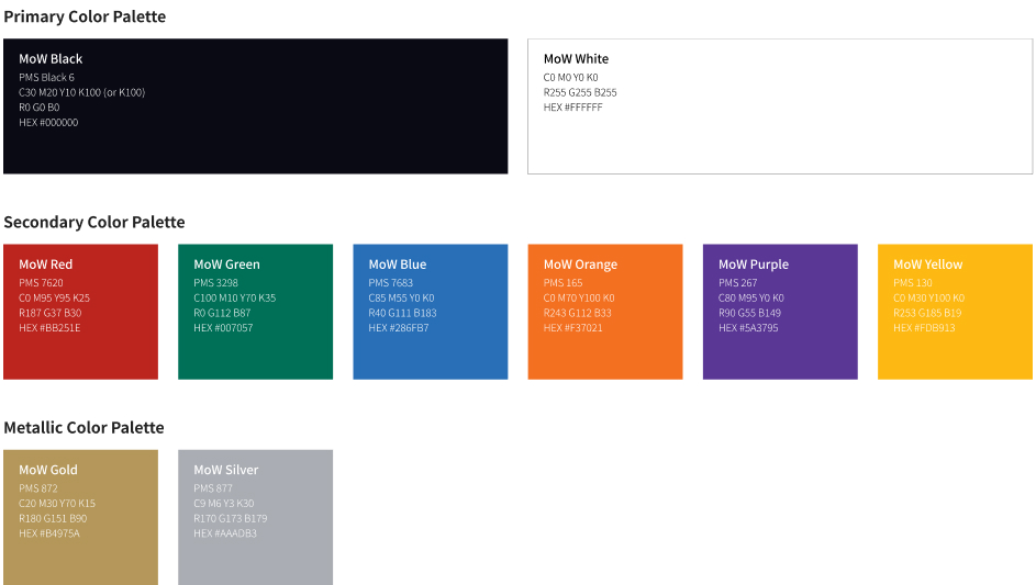
Primary Color Palette
- Mow Black
- PMS Black 6, C30 M20 Y10 K100(or K100), R0 G0 B0, HEX #000000
- MoW White
- C0 M0 Y0 K0, R255 G255 B255, HEX #FFFFFF
Secondary Color Palette
- MoW Red
- PMS 7620, C0 M95 Y95 K25, R187 G37 B30, HEX #BB251E
- MoW Green
- PMS 3298, C100 M10 Y70 K35, R0 G112 B87, HEX #007057
- MoW Blue
- PMS 7683, C85 M55 Y0 K0, R40 G111 B183, HEX #286FB7
- MoW Orange
- PMS 165, C0 M70 Y100 K0, R243 G112 B33, HEX #F37021
- MoW Purple
- PMS 267, C80 M95 Y0 K0, R90 G55 B149, HEX #5A3795
- MoW Yellow
- PMS 130, C0 M30 Y100 K0, R253 G185 B19, HEX #FDB913
Metallic Color Palette
- Mow Gold
- PMS 872, C20 M30 Y70 K15, R180 G151 B90, HEX #B4975A
- MoW Silver
- PMS 877, C9 M6 Y3 K30, R170 G173 B179, HEX #AAADB3
- Dedicated Title Typeface
- The design structure is based on the concept of ‘Regular Script (楷書)’ commonly found in the history of typefaces across all writing systems. The title (signage) exclusive font, ‘Gak’, enhances legibility by significantly enlarging both consonants and vowels, similar to the Korean characters in the *Hunminjeongeum* Haerye edition. Additionally, it draws inspiration from ‘stone carving’ traditions seen in both Eastern and Western typographic cultures to express the strength and resilience of the characters.


- Gak (刻): Grand and Spacious Impression
- The structure of ‘Gak’ combines the spatial elements of the Hunminjeongeum Haerye edition of Korean script with that of Regular Script (楷書), expanding the character’s area while preserving the surrounding white space. Like the body text font ‘Hae’, the characters are symmetrically aligned in all directions, with the center of gravity placed at the heart of each letter. This structure gives ‘Gak’ a grand yet slightly relaxed impression.
The expression of ‘Gak’ follows the tradition of 'stone carving' (서각), a shared feature across both Eastern and Western typographic cultures. The strokes are designed to resemble wedges, reflecting the fluid motion of brushwork, while variations in stroke thickness help balance the asymmetry of individual characters, adjusting their spatial proportions and visual weight. These design elements work together to establish a strong, distinct character with a sense of completeness, making it ideal for titles.
Additionally, stone carving on materials such as clay, wood, stone, and metal traditionally used typefaces that were considered exemplary for their time. Thus, stone carving is closely related to Regular Script (楷書).

- Hae (楷): Calm and Serious Impression
- The body text font ‘Hae’ is designed to meet the specific requirements of various media, ensuring a consistent experience across different platforms. To achieve this, ‘Hae’ was designed to be equally effective on both paper and screens. The stroke contrast is minimized, and sharp details such as pointed serifs or endings are avoided.
As a result, ‘Hae’ features clear, solid strokes that, along with its structure, create a calm and serious impression.
Moreover, to ensure consistency in letter size and weight, 'Hae' incorporates subtle adjustments when characters group together, leaving space between strokes to maintain balance. Even within horizontal strokes, variations in the composition of dots and lines are used to adjust the stroke thickness, controlling the character's visual weight. Additionally, slight curvature in horizontal strokes is introduced to adjust the spacing, while adding a sense of strength within the strokes themselves.